The Room

The Room is a 2003 American independent romantic drama film written, directed, and produced by Tommy Wiseau (and also one of my favorite movies). It's a cult classic defined by being hilariously bad and its website is no different.

  • Role: UI/UX Developer
  • Context: Website Redesign
  • Duration: March 2024

The Project

The goal of this assignment was to practice the workflow of redesigning a simple website. I developed the skills necessary to analyze and identify flaws in an existing interface, create low-fidelity and high-fidelity prototypes for various screen sizes, and build a responsive website based on those prototypes.

Identifying Usability Problems

Problems

Official Website

The official website for the film "The Room" suffers from numerous issues that detract from its credibility and usability. Its lack of organization, unorganized positions of images, GIFs, and jumbled text contribute to an overall sense of spamminess. The absence of a proper navigation menu adds to the disorganization. The site fails to convey a clear message about the movie's plot, genre, or release information, leaving visitors confused and frustrated. Furthermore, the badly cropped and poorly proportioned images only add to the site's unprofessional appearance. The erratic changes in font size and numerous misspellings further disrupt readability, while the cluttered layout and minimal spacing make for a confusing user experience. Additionally, the website's poor mobile responsiveness means that content appears too small to read on mobile devices.
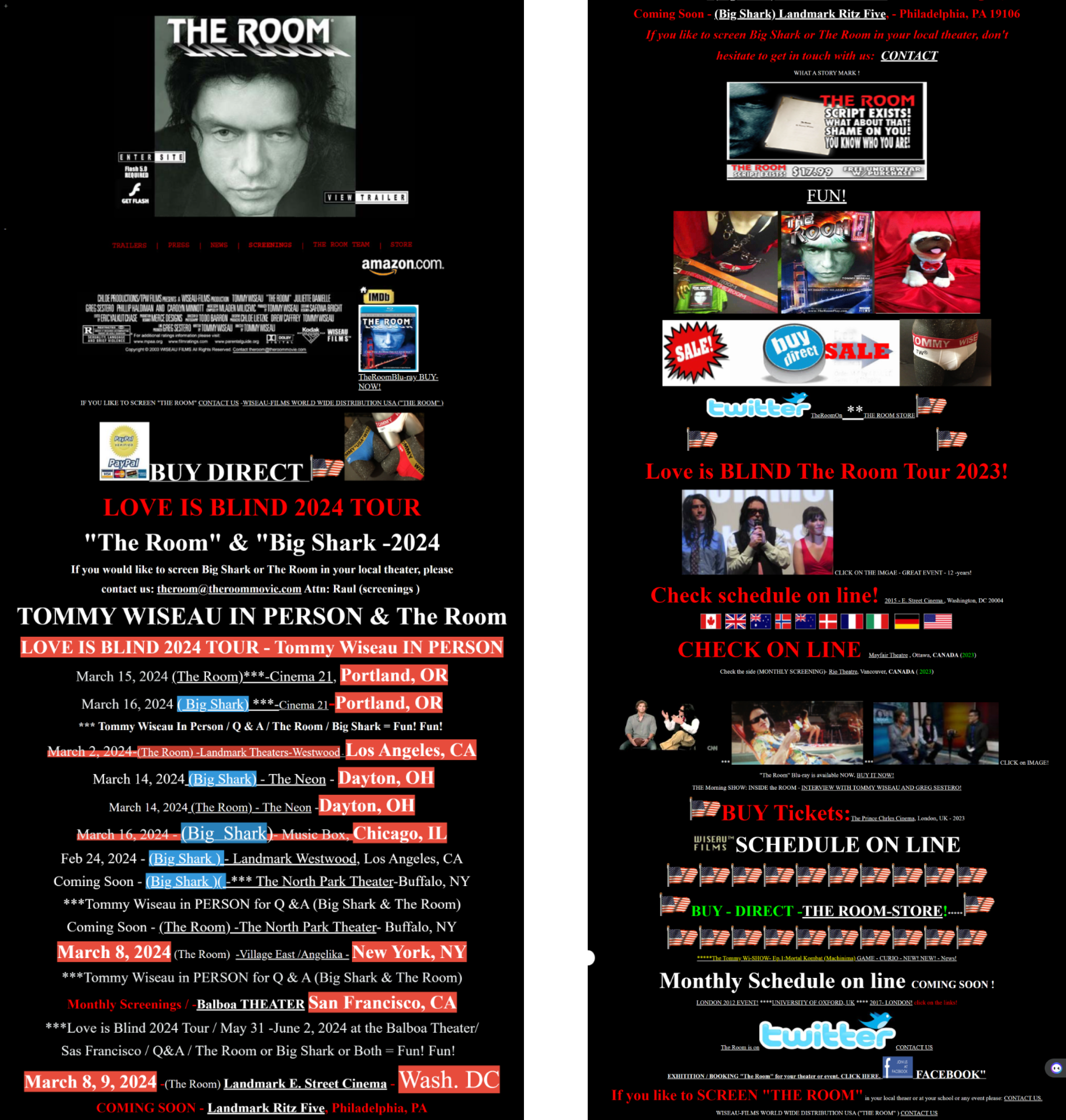
The Room's Official Website

Accessibility

The are also numerous accessibility issues. There are 16 missing alternative text for images, which hinders accessibility, as visually impaired users rely on this information to understand the content. Furthermore, the non-descriptive nature of some alternative text, particularly with the use of acronyms, makes it hard to understand images with alternative text. Additionally, while the contrast in colors may be adequate, the overwhelming amount of content in a confined space creates a cluttered appearance, making it difficult for users to discern important information. There are also 16 redundant links, which complicates navigation and usability.

Visual Redesign

Speed Sketching

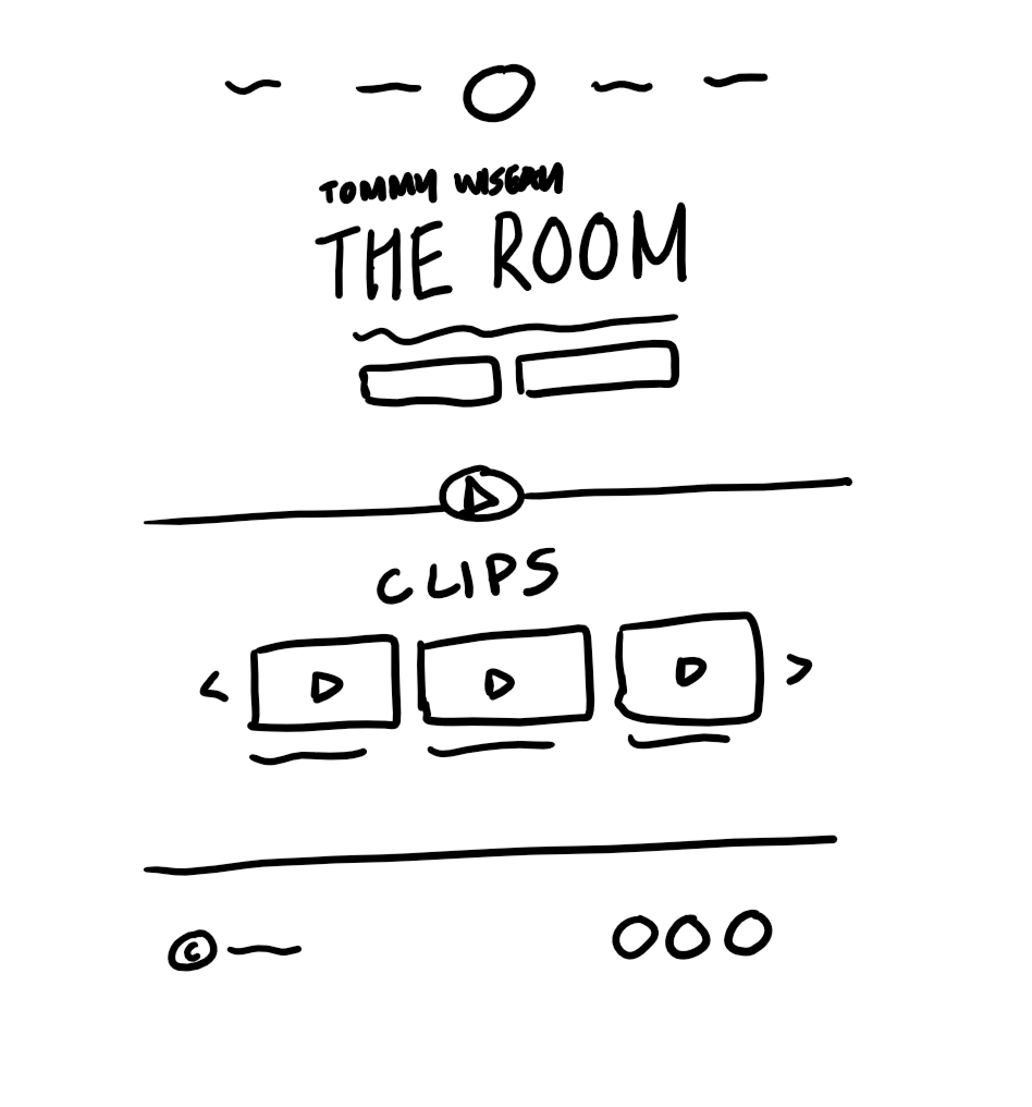
Final Sketch

Elements

    Here are some features I planned to implement to address the usability problems:
  • Navigation bar at top for easy usability.
  • Big title screen with easily-identifable buttons to buy the movie and tour tickets.
  • Spaced-out sections and big headers for readability.
  • Interactive video clip slider.
  • Cursors and animations for links.
  • Alt and aria labels for images/icons.
  • Social media links at footer.
  • Resizes based on screen size so nothing is too small.
  • Consistent font sizes and use of colors.

The Room's Official Website

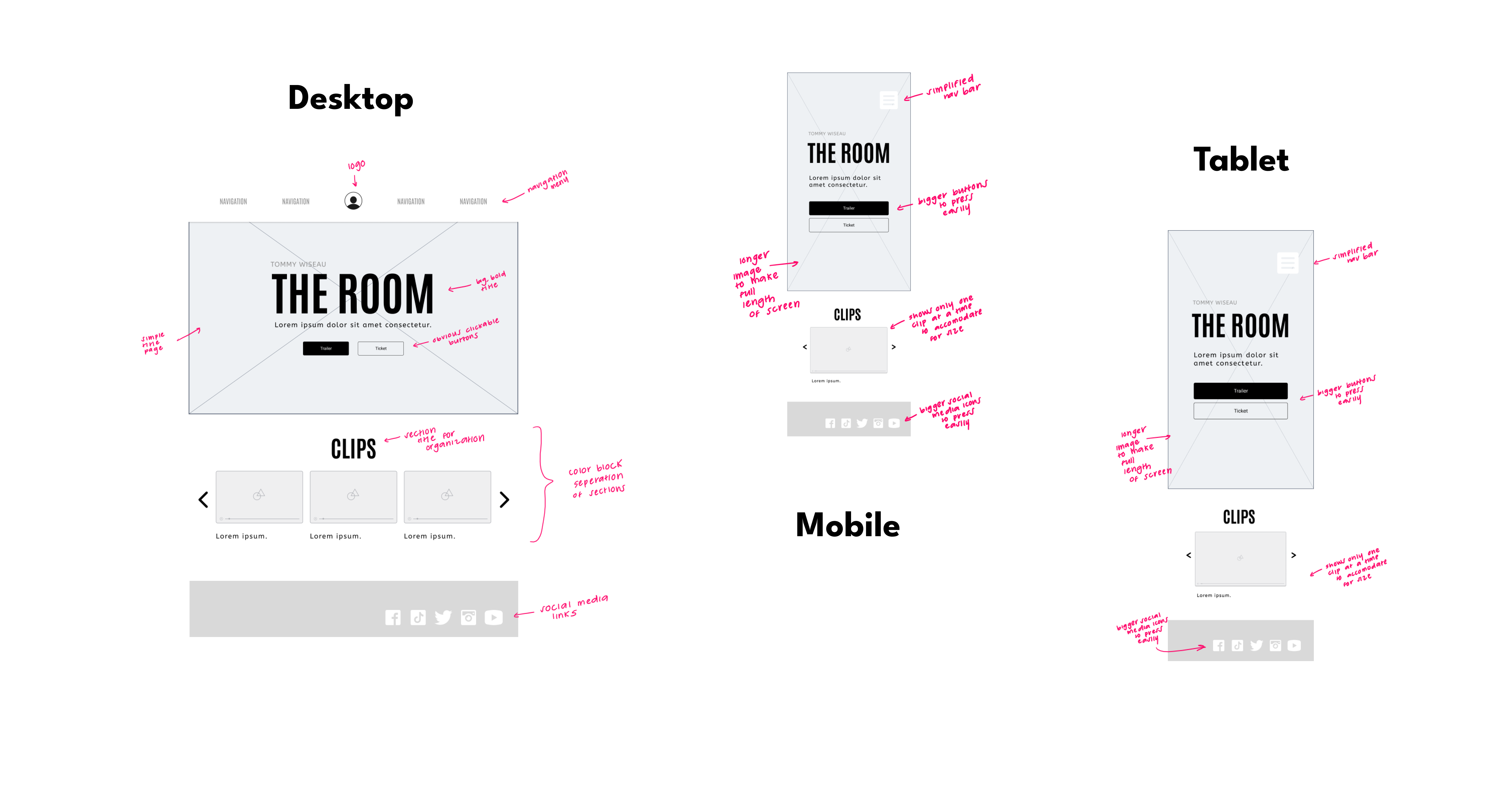
Low-Fidelity Wireframing

Low-fidelity wireframes for desktop, mobile, and tablet

Style Guide

#000000
#FFFFFF
#D42C2C
#AA2323
#4E4E4E
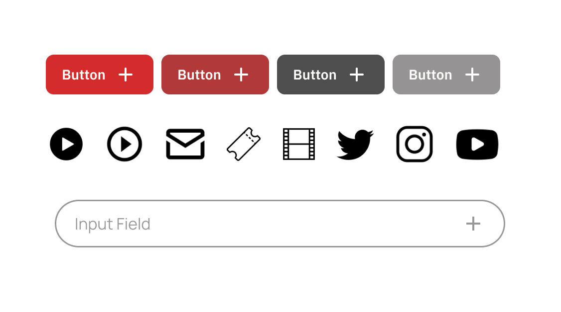
UI components

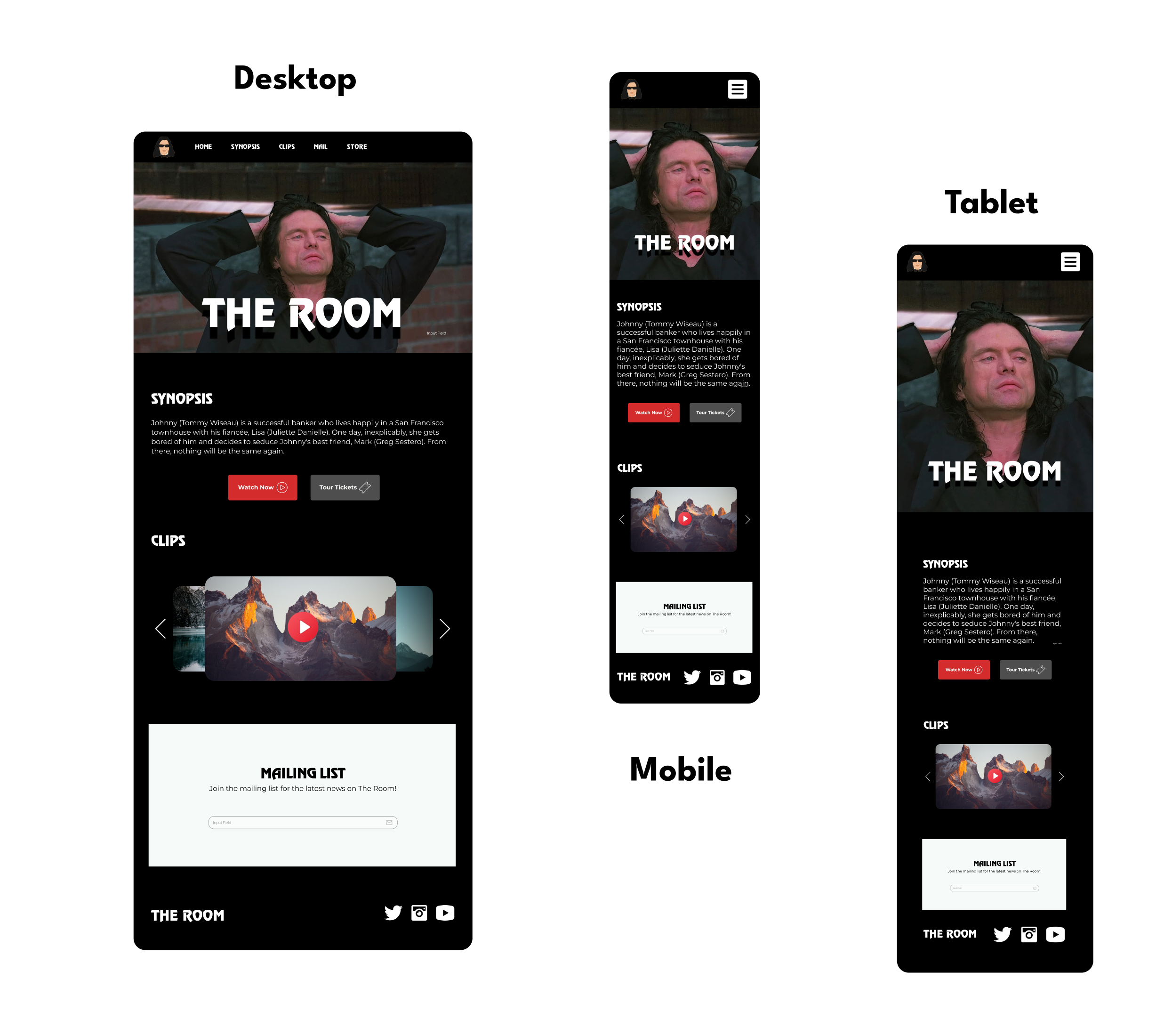
High-Fidelity Mockup

High-fidelity mockups for desktop, mobile, and tablet

Result

Desktop

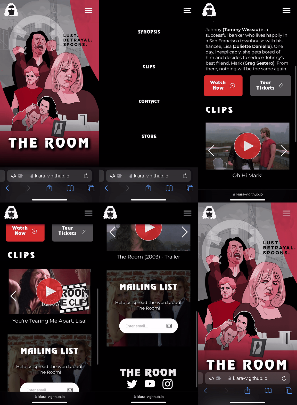
Mobile

Gif of final webpage on mobile
Next Work

A/B Testing

Thanks for messaging!

Let’s talk.

New projects, work inquiry or even a coffee.

Kiara Vong

First-generation college student from Hawaii.

I'm currently a Software Engineer at Capital One. I got my BS in Computer Science at Brown University. My pals describe me as a caring, reliable, hardworking team player. I'm passionate about interaction, UI/UX, and human-centered design. My driving force is understanding people, having empathy towards the challenges they are presented with, and helping them find solutions through intuitive design and insightful interaction. When I'm not coding, you can find me playing with my foster cats, going on Pikmin Bloom, or watching K-dramas!

  • React.js
  • UI/UX
  • is Fun.
  • Semicolons.